Wednesday, March 11, 2015
Understanding Contemporary Art
The world of contemporary art can confuse and frustrate many art lovers and non art lovers alike. Art happening "now" can take on a variety of shapes, sizes and many times materials outside the traditional mediums of fine art. Not only does it look different, it can be displayed differently and explained in a multitude of ways.
Often contemporary art is not straight forward and direct, skills like close looking and critical thinking are required. Enjoying the art of "now" is as much an exercise for your eyes as it is your brain. These attributes may appear as a series of challenges, I however, feel it comes with the territory and should be embraced. There are no rules that state a viewer must enjoy all artwork and contemporary art is no exception.
Where an exception does exist, is in the approach to viewing this artwork. Here are 10 characteristics, I believe contemporary art can possess. Using one of these as your lens through which you view the artwork may help you understand the meaning and heighten your appreciation.
1. Object
-The object is not always the most important piece of the artwork.
-Sometimes the process is the art.
2. Meaning
-What is the purpose?
-What does the artwork represent? To you, the artist, the community, etc.
3. Critical Questions
-Does this artwork only challenge and ask questions or does it answer them?
-Are we called to ask and or answer questions?
-What is our response and what are we going to do in reaction?
4. In Response
-Similar to #3 artwork can be made as a response to an event globally, locally and or personally.
5. Beauty
-Somethings never change. Art can still be made to be admired.
6. Experimentation
-Trial & error.
-Problem solving, showing what worked and what did not.
-Answering a question in a creative way.
7. Collaboration
-A team working towards a common end.
8. Mixed Media
-Traditional art forms, mixed with common or strange materials not typically considered art.
9. Conceptual
-Playing the mental game as well as engaging the senses.
10. Temporary
-Some art isn't meant to stand the test of time. Why is that? What is the bigger statement or motivation behind this limitation?
Contemporary art is always changing, yet often artists draw upon the canon of art history for inspiration. I encourage you when confronted with contemporary art to take one or more of the above themes into consideration. Remember to give yourself time with the art and to challenge yourself to discover its purpose. Question, look again, and remember to enjoy the experience.
Samantha
Thursday, October 23, 2014
Grant Wood: American Gothic
The Cincinnati Art Museum is currently hosting an exhibition titled: "Conversations around American Gothic." The central artwork in this show, is none other than Grant Wood's American Gothic. Typically, this piece can be seen in the collection of The Art Institute of Chicago, however, it is on loan to Cincinnati for this small but powerful exhibition.
Grant Wood was an American artist, 1891-1942. Majority of his works were inspired by his home state of Iowa, American Gothic being one of them. The story goes, that Wood saw a farm house done in the Carpenter Gothic style and began planning a composition with that house in mind. Carpenter Gothic, was a part of the Gothic revival style that became popular in the United States. Characteristics like pointed roofs, scroll work, and details around the windows can be seen in this piece. These structures were easy to make and affordable.
Many questions have been asked about the two figures centered in the painting.
Don't miss this great opportunity, to see such icon American paintings in the Queen City! The exhibition is open from August 30th till November 16th.
~Samantha
Grant Wood was an American artist, 1891-1942. Majority of his works were inspired by his home state of Iowa, American Gothic being one of them. The story goes, that Wood saw a farm house done in the Carpenter Gothic style and began planning a composition with that house in mind. Carpenter Gothic, was a part of the Gothic revival style that became popular in the United States. Characteristics like pointed roofs, scroll work, and details around the windows can be seen in this piece. These structures were easy to make and affordable.
 |
| Grant Wood, American Gothic, 1930. Oil on Beaver Board. The Art Institute of Chicago. |
Many questions have been asked about the two figures centered in the painting.
Are they man and wife?
Daughter and father?
Neighbors?
Actually, the female was Wood's sister Nan and the man was his dentist, Dr. B. H. McKeeby. He dressed them in appropriate clothing for their roles on a farm. The female is looking into the distance, while the man is staring straight on, engaging the viewer. She is closest to the home, possibly a reference to her role in the domestic setting. While, the man is holding a pitchfork and is closest to the barn, symbolizing his role as a farmer. If you look closely, the woman's apron, echos the pattern of the curtain in the window of the house. On the man's overalls, the shape of the pitchfork is implied. In the distance, a steeple is emerging from Wood's stylized treetops. This is one of the most iconic pieces in American Art History. The interpretations vary from mockery, respect, stereotyping, to glorifying. What is your view? Do you agree, disagree or have your own opinion?
In addition to Wood, two other similar artists are featured in this exhibition: Thomas Hart Benton and John Steuart Curry. These three men were known as Regionalists. This title came from focusing on a particular region in the United States. With the idea of showcasing the common, ordinary people from in many cases the Midwestern states like: Iowa, Kansas and Missouri. These artists painted what they knew and understood. Their artwork was relateable, giving us a glimpse into rural American in the 1920s and 1930s.
These men did their part, trying to ease the gap between art and the common man. By painting everyday people doing everyday activities, they made art understandable, and helped viewers make connections in a whole new way. The Regionalists, were realists. They painted what they saw. They did not mock or satirize their subjects, but painted them as a sign of respect for their hard work and endurance.
~Samantha
Conversations around American Gothic
August 30, 2014 to November 16, 2014
The Cincinnati Art Museum and the Art Institute of Chicago will
collaborate in a historic partnership involving Grant Wood’s two
masterpieces, American Gothic and Daughters of Revolution. For the first time, the iconic American Gothic will appear in Cincinnati alongside the Art Museum’s own Daughters of Revolution.
Wood’s iconic paintings will be combined with other quintessential
works by artists of the Regionalist Movement including John Steuart
Curry’s Baptism in Kansas (Whitney Museum of American Art, New York) and Thomas Hart Benton’s Cradling Wheat
(Saint Louis Art Museum). Visitors will be encouraged to compare these
works, stimulating lively conversation about the definition of “realism”
as an artistic style, small town and rural life, stereotypes,
nationalism, and what it means to be an American.
- See more
at:
http://www.cincinnatiartmuseum.org/art/exhibitions/current-exhibitions/details/182-wood-benton-and-curry-conversations-around-american-gothic#sthash.6nOvPTaV.dpufConversations around American Gothic
August 30, 2014 to November 16, 2014
The Cincinnati Art Museum and the Art Institute of Chicago will
collaborate in a historic partnership involving Grant Wood’s two
masterpieces, American Gothic and Daughters of Revolution. For the first time, the iconic American Gothic will appear in Cincinnati alongside the Art Museum’s own Daughters of Revolution.
Wood’s iconic paintings will be combined with other quintessential
works by artists of the Regionalist Movement including John Steuart
Curry’s Baptism in Kansas (Whitney Museum of American Art, New York) and Thomas Hart Benton’s Cradling Wheat
(Saint Louis Art Museum). Visitors will be encouraged to compare these
works, stimulating lively conversation about the definition of “realism”
as an artistic style, small town and rural life, stereotypes,
nationalism, and what it means to be an American.
- See more
at:
http://www.cincinnatiartmuseum.org/art/exhibitions/current-exhibitions/details/182-wood-benton-and-curry-conversations-around-american-gothic#sthash.6nOvPTaV.dpufSaturday, October 11, 2014
Precisionism: Charles Demuth & Charles Sheeler
Art history has a long and detailed story. From cave paintings, to ceramic vessels, to marble statues. Majority of the early chapters of every textbook explore Europe. After many centuries, American art begins to develop and prosper.
Today's post is going to focus on American Art before World War II. These early artists had a choice, to continue the traditions of Europe or to define a new American style. Although the influence of European art movements was felt in America, there existed a desire to create something unique only to them.
First, came American Realism and groups like the Ashcan School, active between 1905-1930. This group of artists centered in New York, showcased common, everyday American scenes of urban life. The term Ashcan School was defined by critics in the 1930's because of the gritty colors these artists used.
This was an exciting time of experimentation and discovery. From oil paints to photography, Americans were creating and defining their signature contribution to the canon of art history.
Precisionism is an entirely American movement, originating during the 1920's along side styles like the Ashcan School. The term, Precisionism was not used till later in the 1940's. Critics labeled this style Cubo-Realist. A combination of Cubism (focus on angles & shapes) and Realism (showing real life subjects). These images are recognizable but not quite naturalistic. They are very geometric and precise, but beautiful in their simplicity, color choice and their ability to capture the American spirit. Many of the paintings were based on sharply-focused photos, some were inspired by poems and other happenings in 20th century America.
Two names are synonymous with this movement: Charles Demuth and Charles Sheeler. Both embodied this style, their works enlightened and informed the viewer.
In this image by Charles Sheeler, we see an urban landscape. The shadows are emphasized and appear in large geometric shapes. Line is a common element repeated in this scene. From vertical lines featured in the buildings, horizontal at the base of each building and the series of diagonal lines indicating movement and excitement.
Rolling Power, shows the importance of detail. It would be easy to mistake this oil painting for a photograph because of its realistic depiction of both light and shadow. Each image is capturing motion, whether in the heart of city life, or through industry and machines. These are only two of Charles Sheeler's great contributions to this uniquely American art movement.
Charles Demuth, like Sheeler utilized line and geometric shapes in his artwork. He too was inspired by the urban landscape in addition to other disciplines like literature. One such example is:
This painting was inspired by a poem written by Carols Williams, entitled: The Great Figure

Today's post is going to focus on American Art before World War II. These early artists had a choice, to continue the traditions of Europe or to define a new American style. Although the influence of European art movements was felt in America, there existed a desire to create something unique only to them.
First, came American Realism and groups like the Ashcan School, active between 1905-1930. This group of artists centered in New York, showcased common, everyday American scenes of urban life. The term Ashcan School was defined by critics in the 1930's because of the gritty colors these artists used.
This was an exciting time of experimentation and discovery. From oil paints to photography, Americans were creating and defining their signature contribution to the canon of art history.
Precisionism is an entirely American movement, originating during the 1920's along side styles like the Ashcan School. The term, Precisionism was not used till later in the 1940's. Critics labeled this style Cubo-Realist. A combination of Cubism (focus on angles & shapes) and Realism (showing real life subjects). These images are recognizable but not quite naturalistic. They are very geometric and precise, but beautiful in their simplicity, color choice and their ability to capture the American spirit. Many of the paintings were based on sharply-focused photos, some were inspired by poems and other happenings in 20th century America.
Two names are synonymous with this movement: Charles Demuth and Charles Sheeler. Both embodied this style, their works enlightened and informed the viewer.
 |
| Charles
Sheeler, Church Street El,
1920. Oil on canvas, 16 × 19-1⁄8” (40.6 × 48.6 cm). Cleveland Museum of Art. Mr. and Mrs. William H. Martlatt Fund, 1977.43. |
In this image by Charles Sheeler, we see an urban landscape. The shadows are emphasized and appear in large geometric shapes. Line is a common element repeated in this scene. From vertical lines featured in the buildings, horizontal at the base of each building and the series of diagonal lines indicating movement and excitement.
 |
| Charles
Sheeler, Rolling Power,
1939. Oil on canvas, 15 × 30” (38.1 × 76.2 cm). Smith College Museum of Art, Northampton, MA. |
Rolling Power, shows the importance of detail. It would be easy to mistake this oil painting for a photograph because of its realistic depiction of both light and shadow. Each image is capturing motion, whether in the heart of city life, or through industry and machines. These are only two of Charles Sheeler's great contributions to this uniquely American art movement.
Charles Demuth, like Sheeler utilized line and geometric shapes in his artwork. He too was inspired by the urban landscape in addition to other disciplines like literature. One such example is:
 |
| Charles
Demuth, The Figure 5 in Gold, 1928. Oil on composition board. The Metropolitan Museum of Art. |
Among the rain And lights
I saw the figure 5
in gold
on a red fire truck
moving tense
unheeded
to gong clangs
siren howls and wheels rumbling
through the dark city
What a fantastic story! Demuth was inspired by this poem and created a visual manifestation of these very words. This painting is bursting with energy. The diagonal lines in the background keep our eyes moving between the four corners of the composition. The red fire truck has been simplified down to shapes and occupies the foreground, and the No. 5 is in gold and centered on the canvas begging to be admired. Can you see the references to the poet? Or the artist's signature? Art history meets I Spy in this oil painting. What all can you see?
 |
| Top Image: CD, Incense of a New Church, 1933. Oil. Bottom Image: CD, Modern Convenience, 1933. Oil. |
 |
| Detail: Incense of a New Church |
 |
| Detail: Modern Convenience |
Both of the above images are from the Columbus Museum of Art. The titles are very descriptive, there is no romance, simply fact. Line, shape and color work together to create a portrait of the American landscape, totally devoid of people. Here instead, the architecture and urban setting are the subject matter, the essentials to the American way, but the overlooked necessities of life. Demuth is a master of layering. His compositions are sectioned off with lines or various shapes. The colors overlap creating depth and texture. Each painting seems to be in motion, if you look long enough you can hear the sounds of industry, smell the smoke and feel the sun on your face.
Precisionism gives us a glimpse of the American past. This movement captures the American spirit and is a testament to the hard work and progress made in the early part of the 20th century. These paintings capture the mood, emotions and atmosphere of the time. As you study these images, reflect on those long ago days of history class and ask yourself why is it important to know or heritage? What value do the stories of the past have for us today? I hope you enjoyed this journey to the past and recognize its importance for us today.
~Samantha
Tuesday, September 16, 2014
Louise Nevelson: Shape, Color and the Universe
Growing up, I was a HUGE fan of coloring. Give me a coloring book and a box of crayons and I was a happy camper. Not only was the act of coloring enjoyable, but reading all the names of each crayon was a treat. Sometimes a bit over my head, or extremely familiar like Tickle-Me-Pink and Macaroni and Cheese. Even today I enjoy the occasional coloring book with all my favorite colors. Although most of my interests have remained the same, I now analyze that box of crayons, looking and using colors that weren't of interest to me growing up. One such color I have rediscovered is black. A useful and multifunctional color, but one used more for necessity and not for pleasure. Now, as an adult my entire viewpoint on the color black has changed. I now view this color as elegant, refined and the epitome of classic.
An artist who perfectly captures this respect and admiration for this sophisticated color is Louise Nevelson. Not only did she favor black, but her work focused on the element of Shape, a nice follow up to my previous post on the work of Frank Stella.
 |
| "I create my own universe with shape." |
Her story has always fascinated me. Born in Russia, her family moved to Rockland, Maine at the age of 5. After her marriage, she found her way to New York City. Nevelson was a wife, a mother and an artist. When forced to choose what to devote her time to, the role of artist won. She embodied the fierce spirit of a woman on a mission. The choice to be an artist and not a stay at home mother was personal. I am neither praising nor judging Nevelson for her actions, but admiring her determination. After a period studying art, having very little money, selling little to nothing, she finally had her first show in 1941. Trial and error, plus another two decades would lead to the breakthrough that is characteristic of the style we know and love.
Nevelson, was up-cycling and reusing materials well before the curve. She would pick up wooden pieces from the side of the road, broken disregarded objects would become beautiful works of art in her skilled hands. She would assemble such pieces in sections, or individual boxes, and then combine these units together. What is so unique about her work, is the combination of several sculptures working together to create one overall environment. Nevelson is labeled as a sculptor, but her work is so much more than a static three dimensional object. As she said, "I create places not sculptures." I couldn't agree more. Her work transports you through your own imagination. You recognize objects and make others up all in the same breathe. It's impossible to be bored when faced with a Nevelson installation. Just like her work, she was a character. With her layers of fake eyelashes, head scarves and shawls, she demanded attention.

In her work, she favored three main colors: white, gold and of course black. Each piece would be made up of smaller objects, but in the end everything would be painted a solid color. This way the viewer doesn't not focus on the function of one element, but on the work as a whole. The color unifies and presents a new opportunity to us as the viewer. To Nevelson black was aristocratic, weight less and most of all, containing all colors. This is exactly my feeling towards this often over looked crayon in my box. Her pieces are magical and inviting. When I stand in front of her work, I can imagine my favorite story coming to life, like I've become Alice, about to step into my own Wonderland. Lucky for me and you her work is very collectible. In Ohio alone, three premier institutions have pieces including: The Toledo Museum of Art, The Columbus Museum of Art, and The Dayton Art Institute.
From The Toledo Museum of Art:
 |
| Louise Nevelson, Sky Presence 1, 1961, Wood & Black Paint. |
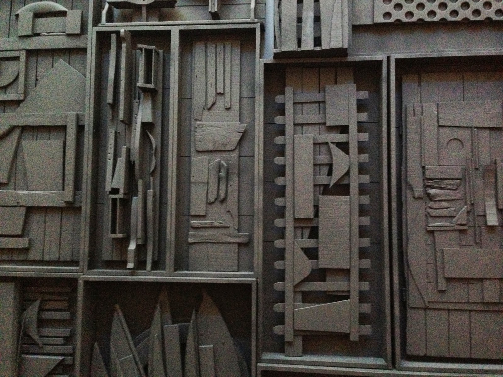 |
| Detail from Sky Presence 1 |
From The Dayton Art Institute:
Each is one work of art composed of hundreds of other objects. Once a table leg, a railing, or a crate that outlived its purpose, it is transformed into a monumental and permanent work of art. What objects can you identify? Which are familiar to you and why? Did you ever view them as works of art before?
 |
| Louise Nevelson, Untitled, 1985, Wood & Black Paint. |
 |
| Detail from Untitled |
In addition to being painted one color, Nevelson often worked in series, naming each piece for what it represented in the collection. Her motif: everyday objects re-purposed. Notice in the details that she did not altar the pieces that she found. If there was damage, nails or holes she let them show. Even art can be rough around the edges. She showed us beauty in the ordinary, that natural is more fulfilling than a fake veneer of beauty.
Talk about seeing the beauty in every day objects. Look around you, can you view your common, ordinary objects in a new light? Imagine unifying objects with color. Which color best represents you and why? Has this changed throughout your life? If everything is the same color what happens is the focus is not on the purpose or use of the object, but its form and shape, finally it gets to be appreciated for being itself and not for its usefulness. Louise Nevelson was more than a sculptor, she was a creator. What beauty can you create today?
~Samantha
Monday, September 8, 2014
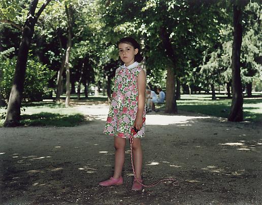
Artist Highlight: Rineke Dijkstra
 |
| Beach Portraits, 1992 |
The work of Rineke Dijkstra, a Dutch artist who utilizes photography as a vehicle to create compelling portraits, has always fascinated me. When we think of portraits, generally a picture of a person looking at us, smiling, and seemingly happy comes to mind. Or perhaps, the generic grade school photos are more prominent. Whatever the case may be, having a picture taken of you always leads to a pose, smiling, and saying cheese. Dijkstra's photographs don't fit that description. In a way, they take a step further and show a true likeness of the individual she captures in her lens, rather than the facade that can be created by the 'cheese' effect. She typically chooses young adolescents or young adults as her subject matter, perhaps because they are the ones still constructing their identities, making the likeness all the more challenging to capture. And sometimes her choice of subject matter may be what what makes her photographs so enticing, moments in time with awkward youths, new mothers after birth, and intrusions in the park all give the viewer a feeling that they are an interloper into the private space of the subject.
 |
Her most striking portraits were produced when she photographed women after having just given birth. Standing against a backdrop of stark white hospital walls, the viewer is presented with a new mother and her infant, still nude and not yet sure of the role that she has just taken on. A woman in a liminal space, one identity has been left behind and one is before her waiting to be donned. What strikes me the most is the contrast these photographs offer between what we all imagine those first moments between mother and child to be, and the reality of what they are. The surroundings that are utilized in all of Dijkstra's work emphasize the connection, or lack-thereof, of the subject with the photographer and the silent conversation between the two that may or may not be taking place.


To me, Dijkstra's portraits are all about the self, identity and the liminal space where they meet and are performed. We constantly are changing, whether in the roles we choose to play or those that or forced upon us. And in a world where so much of who we are and how we depict that is created through our own choice, these photographs depict individuals at moments in time that seem private or unexpected, allowing the viewer to witness a sense of confrontational self-consciousness, if you will.
So what do you think? Do her photographs allow for insights never seen before? Do they make you uncomfortable? Do you consider her photographs portraits?
Thursday, August 28, 2014
The Shapes of Frank Stella
As an art history teacher, I believe it is important to have a solid understanding of the art vocabulary. Not only will art history lectures and text books finally become clear (I hope), but you are better able to articulate what's in your head.
My word for the week is SHAPE or an enclosed area. We have such a variety of shapes to choose from such as: rectangles, circles, squares, triangles, geometric vs. organic, etc. These enclosed areas are often secondary, maybe in the background, and are rarely the focal point of an artwork.
Today, I'm highlighting an artist who focuses on shape and shape alone. Not only are shapes the most important aspect of his paintings, they are the painting. Who other than Frank Stella. The man who literally thought outside the box, or in this case the canvas. Tradition is comforting, it is familiar, however, it is not the only way. Rectangular canvases...or is there something more? Stella is most known for his unusually shaped canvases. Here we are presented with a triangular shaped canvas, featuring 3 colors: yellow, pink and tan. The pink triangle is overlapped with a bright yellow square with a line extending to the left.
The tan acts as a border framing the pink and yellow shapes. A great example of an overall composition, the background, middle ground and foreground become one. Our subject matter consists of shapes and colors nothing more and nothing less. Stella has been labeled as a Minimalist. A style that used industrial materials, neutral color schemes, focused on form, precision and strove to communicate ideas in a new fashion.
My word for the week is SHAPE or an enclosed area. We have such a variety of shapes to choose from such as: rectangles, circles, squares, triangles, geometric vs. organic, etc. These enclosed areas are often secondary, maybe in the background, and are rarely the focal point of an artwork.
Today, I'm highlighting an artist who focuses on shape and shape alone. Not only are shapes the most important aspect of his paintings, they are the painting. Who other than Frank Stella. The man who literally thought outside the box, or in this case the canvas. Tradition is comforting, it is familiar, however, it is not the only way. Rectangular canvases...or is there something more? Stella is most known for his unusually shaped canvases. Here we are presented with a triangular shaped canvas, featuring 3 colors: yellow, pink and tan. The pink triangle is overlapped with a bright yellow square with a line extending to the left.
 |
| Frank Stella, Union 1, 1966. Paint on canvas. |
To be honest, this is not my favorite type of art. Most Minimalist artworks seem very cold and formal to me. I dislike the bland colors and feel the simple compositions are not challenging or very enjoyable to look at. That is until I encountered the work of this artist. Who knew simplicity could be beautiful? There is no confusion here, as Stella said, "What you see is what you get." How perfect. He is direct and to the point.
Look, see, and understand. Art is not always complicated. Simple yes, refreshing defiantly. Stella proves there are still uncharted frontiers in the art world. Manipulating the platform in which the art is presented, he made the canvas apart of the composition instead of merely being a support or backdrop. This treatment has finally brought shape into the limelight. Although this is a standard rectangle, the painting below also glorifies shape and uses color to help distinguish each curve and circle. A solid background pushes our arrangement of intersecting shapes forward. The clean lines makes this feel finished and neat. The surface treatment, and the attention to detail makes Stella a Minimalist. His treatment of boundaries and experimentation in color make him a Modernist.
 | |
At first glance these paintings might seem unextraordinary. Challenge yourself to look closer and to interpret what this new idea could mean. Is Stella challenging the status quo? Is this a statement? Or maybe it is purely for aesthetic purposes? Debate the significance of tradition. What are the pros and cons? Should there be more or less experimentation in the art world? Such questions keep the debate alive, forever adding to the canon of art history. Again, "What you see is what you see," And what is it that you see?
~Samantha |
Monday, August 25, 2014
The Museum Experience
What makes a good experience in a museum? Is it seeing a special exhibit that you've been planning to see for weeks in advance? Is it seeing something unexpected or new? Or is it viewing the work of an artist you have studied before and you become reacquainted with an old friend? I had the opportunity to visit two, yes TWO art museums in one weekend, and let me tell you, each experience was unique in many ways- so I thought why not pass along what insights I've gained into the making of a great experience in an art museum.
 |
| Flint Institute of Arts: Me under/in an old Medieval/Renaissance Fireplace Have fun with your visit, document when possible! |
 |
| Examine works closely, consider all angles! |
 |
| Museum Selfies are important! |
1. What is your limit? In other words, know how long it takes before you reach the point where you can't stand another minute or you need to put food in your tummy. Also, consider whether you will dine in the museum at their cafe or if you have to find food once you leave. This always drastically effects my experience in the galleries.
2. Talk to the people you are going with, find out what they want to see, what you want to see and what you both can do without to maximize your experience without minimizing your enjoyment.
3. Ask questions! Whether you are in conversation with yourself, a gallery guard, or your friend- talk about what you are seeing. Figure out why you like it or don't like it! Don't just walk by say eh and be done with it.
4. Look. This takes more than 3 seconds. Let your eye glide over the work of art, consider the text that is written if you like, look at the fine details. Examine all possible views or angles! In other words, really see the work of art rather than just notice it and continue walking.
5. If you enjoy a work of art- get excited by it! If it is something you are surprised to see or find it particularly pleasing to the eye- let someone know. Appreciating art and having an experience with it doesn't have to be an internal process that you keep to yourself. One of the most contagious things in an art museum is people getting excited about art!
6. Take notes! If there is a piece that has you intrigue and you want to know more, write down the title and name of the artist. Your learning doesn't have to end when you leave the museum, find out more when you go home.
 |
| Expect the unexpected! Get excited when you see something cool! |
 |
| Art Appreciation at its finest! |
 |
| Become an artist yourself! If photos are allowed, take them- they will create lasting memories! |
 |
| Go with friends who challenge you and your views on art- it will be highly rewarding! |
 |
| Ahh Monet, how I love thee! So far I have seen 38! |
Subscribe to:
Posts (Atom)