Thursday, July 24, 2014

Function vs. Aesthetics

Which is more important, form or beauty?
In my opinion, both matter. Why choose between one when you can have both? Ceramics, to me best embodies an art form that is functional yet can be beautiful.
Historically, the answer to this question has been aesthetics or beauty. The fine arts were believed to be masterful expressions of emotion, movement and of course beauty. The idea of art being functional and useable is a modern concept. Similar to last week’s post on Photography, another division in art history revolved around this dilemma between function and aesthetics, between fine art and crafts.
What are crafts? First, we must define what art forms fall under this category. By the 18thcentury clear divisions were seen. Painting and sculpture had the highest status. Lower forms like ceramics, embroidery, weaving, and glass were considered crafts. The difference was function. This phenomenon is unique to Western culture. With time, crafts grew to be more appreciated and respected within the art community, falling under the label of decorative arts. Although this is a slightly derogatory term, now at least these objects are being collected and displayed in museums and galleries around the world.
One of my favorite crafts is ceramics. From hand building to wheel throwing, I will give you a brief introduction to the technique. The main ingredient is clay. Clay like flour comes in all different colors and textures, from stoneware, terracotta, to porcelain. Once the clay is shaped, it dries and is then fired in a kiln to become hard. Here are the steps:
1. Pick a clay body (stoneware, white, porcelain, etc.)
2. Wedge (like kneading bread) remove all air bubbles
3. Cloil, slab, pinch, or throw your desired shape/vessel
4. Dry the object
5. Fire in a kiln (wood, gas, electric, etc.)
6. Glaze or paint the object
7. Glaze fire in the kiln to complete
Wheel throwing is the shaping method created on a potter’s wheel. The Chinese began doing this in 3000 BCE. The lump of clay is centered, then using their thumbs a hole is made in the middle. Then the walls are built up. Steps:
1. Center the clay
2. Using your thumbs, open a hole in the center
3.  Pull up the walls
4.  Shape the vessel
5.  Cut off wheel

Eva Zeisel was a gifted ceramist and designer. She used both hand building and the throwing methods in her work. Born in Budapest, Hungary on November 13, 1906, she passed away in 2011 in New York. You can view her work in the collections of The Art Institute of Chicago, the British Museum, the Metropolitan Museum of Art, the Museum of Modern Art and the Victoria and Albert Museum. Over 75 years of creating and designing very popular modern designs, helped establish her place in history. She was a designer, a ceramist and a teacher. Her work is classic and timeless.


Zeisel created functional objects that were graceful and light. Her designs still remain popular today. Everything she created had a purpose, many of which could be used in the home, from dinnerware to serving tea. Her intention was to honor the function the object was to perform, yet that did not take away from its design.


This Museum Dinner Service, 1946 shows three soft white serving dishes. They seem delicate yet capable. Their shape is very organic, no rough edges or manufactured stiffness to be seen. The solid white color shows off the form of each vessel. Using these objects creates a presentation, eating will never be the same mundane task again!


Museum Dinner Service, 1946 is as popular as ever. By studying the teapot, we clearly see where the handle was added. Usually, we desire to hide such imperfections but not here. Instead the hand assembling is glorified, a connection is made between the artist and the clay and the view and the object. Her superior craftsmanship makes us respect and cherish her objects. We would enjoy making and serving tea if we had such beautiful vessels. These objects serve a very straight forward function, yet we do not view them as tools but as works of art. It feels right to display them behind glass, yet we desire to hold them. Her delicate curves and graceful appendages transcend craft placing her work on a pedestal.
Ceramics can be labeled and displayed as craft, but that will never take away from its inner beauty. You too can create gorgeous hand thrown objects. This technique gives you that ability. Nothing compares to the joy and pride of making something pleasing to the eye that serves a greater purpose. I challenge you to explore the world of ceramics, wedge some clay and let your creative juices flow. ~Samantha

Friday, July 18, 2014

Before the Masters: A Study in Black & White


One of the great debates within art history revolved around the technique, "drawing with light" or photography. The question: is photography a fine art?

There were many factors involved in this equation, such as skill. Some believed the camera was the true artist, that with a click of a button the perfect moment would be captured by a machine. Others, believed the camera was simply a tool of the trade, similar to a paint brush, that it took the talent and critical eye of a photographer to yield true results.

Once the debate between man vs. machine was solved, the question shifted to the final product. What was a photo? Was it a document? A record of a particular moment in time? Or was this something to be compared to an oil painting or landscape drawing?

Creditability, also played a role in this great debate. Who were the greats among this technique? What were the distinguish schools, one could attend for training? This brings me to my favorite characteristic of photography: freedom. The established schools and academies were not available for early photographers, the ability to study at famous museums admiring and coping the masters was not a option. Instead, anyone determined enough to learn the trade could. Women in particular took to this medium. With hard work and practice they were considered important members of the field. This was highly unusual. Women had historically been rejected from art schools, training, and life drawing classes. This greatly prevented them from perusing certain art forms like history paintings, that required an extensive knowledge of human anatomy. Photography was new, exciting and open to all.

Today, photography has fought its way into the art history textbooks as a fine art. In addition, photographic history classes exist, telling a more in-depth version of its history. Finally, photography is receiving the acclaim it deserves. In my opinion, I feel photography has been more impacted by improvements in technology than many of the fine arts like painting and drawing. We are losing the processes first used in this field like the darkroom. Fewer and fewer exist. More digital photos are being produced. Advancements are essential and important to the development of an art form, but not at the cost of this roots. Therefore, I would like to showcase a more traditional technique with today's artwork, an elegance that cannot be manufactured.
                                                                               
Here is a gelatin-silver print, created by Edward Steichen an American photographer. Steichen would go on to become the Director of Photography at the Museum of Modern Art (MOMA), where his thoughts and acquisitions would go on to inspire generations.

    Edward Steichen, Heavy Roses, Voulangis, 1914.

Wednesday, July 16, 2014

The Art of Memories

One thing that has always intrigued me is the intrinsic connection between art and memory. Specifically the way in which art is used to capture those snippets of time, and document the people, places, and things we most hope to remember. This connection has been in place for hundreds, perhaps thousands of years. Some ask what is the purpose of art, or why do we need it in our lives? There is a myriad of responses that I can give, but instead I will show you some examples. 


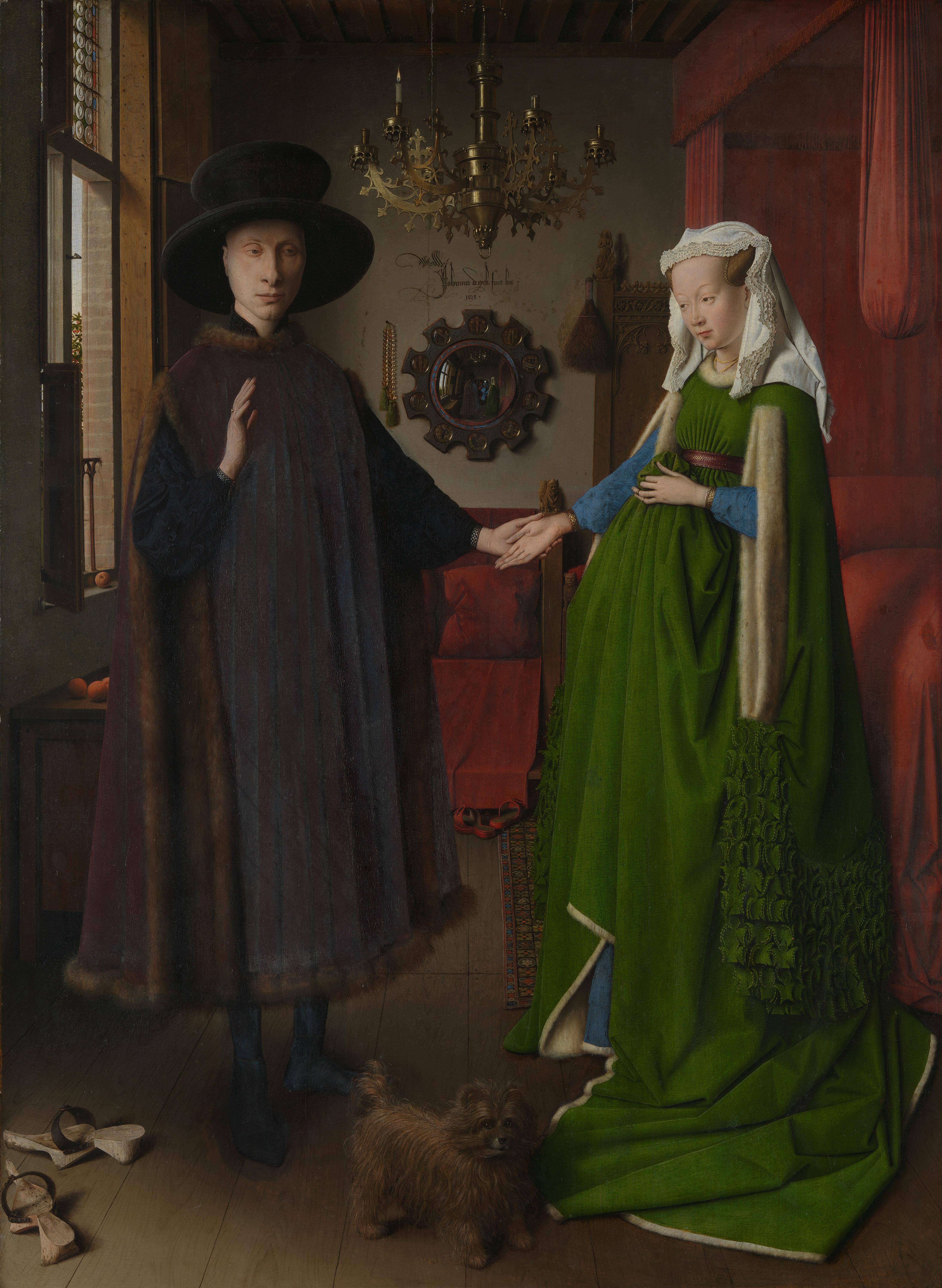
Jan van Eyck, The Arnolfini Marriage Portrait, 1434

( http://www.nationalgallery.org.uk)
This is the Arnolfini Marriage Portrait painted by Jan van Eyck, a master artist of the 15th century
Northern Renaissance.  It serves a number of purposes, as a double portrait of this newly married couple, documentation or proof of the marriage and its witness, and perhaps not as obvious, a physical reminder for this couple of the day of their nuptials during a time when photography had yet to be invented. It is celebrated in art history for the exact and precise hand of the artist, as well as the iconography incorporated in the image. This form of memory-making/ memory-keeping is still practiced today by couples on their wedding day, however photography is the medium used, due to the ability of the photographer to capture both the posed portraits and candid moments of the couples special day. In fact, searching for the perfect photographer is often part of the many items the bride checks off the list in preparation for her big day so that the images that are left are in a style in line with the bride's tastes.


William Henry Jackson, Mouth of Patterson's Creek, 1892
(http://www.artic.edu/aic/collections)


 Another purpose art has related to memory is to document change over time. William Henry Jackson was one of the many photographers tasked with the documentation of American expansion westward in the post Civil War era. From these early photographers we have in our collective possession images of our country that have nearly ceased to exist due to the constant change and evolution of the American landscape. Photographs play a huge role in the memories we have and make. Major events in our history are best remember through the images that were left behind. The Great Depression, WWII, the Vietnam war, the Civil Rights Movement, these are all events in which we have striking memorable images- works of art- that help us remember. 


Pierre-Auguste Renoir, 
Lunch at the Restaurant Fournaise, 1875


Finally, we also find examples of artists attempting to recreate the effects of memory andthe way we remember images and events. The Impressionists were one group of artists at the turn of the century who painted in a style that gave the impression of how and/or what the artist was seeing. Rather than attempting to document every possible detail, the Impressionists attempted to recreate the play of light and color on their surroundings. We are able to read or understand the environment and what is being depicted, but the image is slightly blurred, almost as if the artist closed his eyes and painted the image that his memory was recalling instead of what was right in front of him. 


These are just a few examples of this intrinsic connection between art and memory. I can't help but wonder if it is so palpable because of our dependance on our senses, specifically vision, when it comes to living our lives, as well as our communication through art. 

~ Caitlin 


Thursday, July 10, 2014

The Color of Expressionism

Art history is a discipline full of isms. The focus today will highlight the movement Abstract Expressionism, also known as The New York School.

This was the 1st modern art movement to begin in the United States. The 1950's saw the shift from Europe to New York as the new art center, and with that came a desire for pushing boundaries. 

Abstraction comes in many forms. From simplification, non representational to all over compositions. 

Lee Krasner was the only female artist of the 1st generation Abstract Expressionists. She was greatly overshadowed by fellow artist/husband Jackson Pollock. Her all over abstract compositions feature a vibrant array of colors drawing the eyes all around the canvas. Towards One 1967, showcases a complementary color scheme. 


Context is essential. We need to have a firm understanding of the time and society the piece was created in. I admire Krasner for a variety of reasons. Chief amount them was her unique signature: the gender neutral L.K. She wanted her work to stand on it's own, gender and husband aside. Her work is open for interpretation. The white space emphasizes the bright fuchsia spirals occupying the center. A very organic forest green creates a border around the piece. 


Look, enjoy and appreciate. Abstraction can be frustrating because it's so open ended but to me that's freeing. This week take a moment to enjoy and reanalyze an abstract painting. Explore the possibilities!

~Samantha  

Wednesday, July 9, 2014

Finding what moves you...


            This can be hard to identify but once it is realized, it hits you like a lightening bolt and you can never go back. That's exactly the way it was for me with my first encounter with the work of Claude Monet. I was an  art history major in undergrad visiting the Art Institute of Chicago for the first time. This wasn't my first interaction with art or the first time I had seen a work by Monet, but it was my first in-person experience with the artist's work. I walked into the gallery that houses roughly 12-15 Monet canvases and for some reason tears started forming in my eyes. 
Photo taken in galleries at the Art Institute of Chicago
           Even now, years later I still have a visceral reaction whenever I see a "new" work by Monet, one that I have never seen before. I still cannot explain why Monet though. Yes, his work is exemplary and held to be of great importance, but his work is also very easy to like, pretty. After studying art history for some years now and examining the works of Monet more closely, along with countless other artists, going on many museum visits and exploring other works, I have found to critical elements that show up again and again in the works that my eye enjoys- light and color. Monet's work is an examination of these to elements of art and life that comes together to create works that resonate within me and many others.
Close up of a Monet painting
                
         Finding works of art that emotionally, physically, or even intellectually move you can be challenging and difficult, but once you find it, treasure it. Each new Monet that I visit is like a feast for my eyes... I take in every detail, from the brushstrokes to the colors. I sit and take it all in and I stand as close as possible. Finding Monet was like opening a door  and stepping through into a world I had only been looking at through a window. One that for me is dominated by light and color. This world is different for each of us... maybe it is the crisp lines and tones seen in a black and white photograph by Ansel Adams or the playful codification of a Jeff Koons sculpture. Whatever it maybe, when you find it, hold on to it, pursue it, and challenge it, and you will reap the benefits. 

~ Caitlin


Thursday, July 3, 2014

Tara Donovan

Today, I'm highlighting the installation artist Tara Donovan. In 2010, The Indianapolis Museum of Art commissioned a large scale abstract sculpture called Untitled (Mylar).


Why do I think her work is fabulous? The larger-than-life scale of the piece towers over you, bringing you into a sparkling world of Mylar bunches. She and her assistants, arranged the material in a way that encourages the audience to come forward for a closer look. Round bunches are grouped and stacked, forming a black and silver landscape. The reflective material plays with our sense of depth. She creates a new world that seems to grow as you look. 


Working off of the readymade concept, Donovan uses industrial materials but gives them a new organic purpose. Repetition of form is the bases of this simple yet stunning sculpture. Donovan transforms the act of perception by showcasing hidden sides of common materials, often overlooked as dull. She creates beauty from the ordinary, challenging us to continue the exercise. 

My challenge for you this week: find beauty in the unexpected. ~Samantha

Tuesday, July 1, 2014

Textiles, Artprize, and the GRAM


Recently I had the pleasure of visiting the city of Grand Rapids and a visit to the Grand Rapids Art Museum is a must when you are in this area of Michigan. The museum itself has a collection that focuses on 19th century, Modern and Contemporary Art, but it is an institution that has also been integral to fostering a art-minded community. Outside of its building is a public space designed by Maya Lin which reflects the importance of water to the city. This space is just the tip of the iceberg when discussing art in Grand Rapids, MI. The most noticeable impact of art on this community is a three-week long event called Artprize. For those of you who have not heard of it, it is a international art competition juried by the public that features all ranges of people, ages, styles, media, and subject matter. Each year hundreds of works/artists are chosen to participate and a winner chosen at the end of the three weeks. Every year new favorites are picked and the community becomes enlivened by the art that is displayed on its street corners, in its banks and restaurants, and upon its walls. During my trip to the GRAM I saw entries by participants of the past year and the winner of 2013 (image above, details below) I was excited to see the piece that won for 2013, for it combines all the major components needed for a skillful and engaging work of art. An intriguing design, delicate handling of materials, and a wealth of inspiration.
The winner, Ann Loveless, created the work above "Sleeping Bear Dune Lakeshore" out of vibrant, carefully chosen fabrics. The work skillfully displays an art form that many of us may interact with on a daily basis in a very mundane sort of way, for this work is made up of 4 panels 5 ft. tall by 20 ft. wide that were machine quilted.  The colors utilized are bold and vibrant, serene and calm, working together to produce a breathtaking landscape out of fabric. When approaching the piece, the complexity of it comes to the fore. It is obvious that hours of planning and executing went into the production of this piece. The eye reads these colors as if they each a piece of a puzzle, but at the same time it seems like a layering of fabrics had to have taken place to achieve such perfection, much like artists layer and build up oil paint on a canvas.

The artist works from photographs, this particular view is of Sleeping Bear Dunes from the shores of Lake Michigan. Loveless is a quilter of landscapes, bringing them to life with her blending of rich hues and the movement that is an inherent quality to the technique of quilting. From what I have found out about her, she is more of a non-traditional artist, having obtained her degree in Clothing and Textile Design from Michigan State University. In a world that seems dominated by the MFA, exhibitions, and galleries, it is encouraging to see an artist with an amazing eye for color and light to be working in such a normal material, one that we physically come into contact with daily. Her work is a true intersection of life and art.

It is a breath of fresh air to walk through a museum, seeing excellent examples of modern and contemporary painting and sculpture, and then to come upon this piece of what may be referred to as craft. It challenges the stereotypical notion of what art is, or rather what it should be. In fact, in some ways this piece provides visitors to the museum an introduction to contemporary art of the 21st century, for it represents in some small way the multifaceted nature of today's art world. Art can be a million and one things, beautiful, thought-provoking, extreme, skillful, life-like, ugly, meaningless, or appropriated. It is up to the viewer to consider it and see it for what it is and what it can be, life. 

~Caitlin